Business of Home

Modernizing a leading industry media platform through a scalable design system

PRODUCT DESIGN

DESIGN SYSTEM

UX/UI

Summary

Summary

Project Overview

Established in 2009, Business of Home has become the home industry’s leading business media brand, delivering news, analysis, and insights to interior designers and industry professionals.


Over the years, its digital platform had accumulated visual and UX inconsistencies, while legacy code made larger structural changes difficult. The redesign was an opportunity to modernize the experience while creating a more systematic foundation for future growth.

My Role

As the sole Product Designer, I worked closely with the Editor in Chief and one engineer to lead the redesign across BOH’s reader-facing website, user dashboard, and supporting experiences.

A full UX overhaul wasn’t feasible, so we took a pragmatic approach: preserve the existing information architecture and technical foundation while focusing our resources where design could have the greatest impact.

Key constraints included:

  1. A lean team of one product designer and one engineer.

  2. An existing information architecture tied to legacy code dependencies.

  3. The need for a flexible design system that could support the current redesign while making future updates faster and more consistent.

Deliverables

Reader-facing website redesign

User dashboard redesign

New design system

UX improvements across website and editorial tools

Highlights

96+ web pages redesigned

100+ components created

20+ UX issues resolved

Part One — Modernizing the Experience Without Rebuilding the Product

Because the information architecture and underlying code needed to remain largely intact, the goal wasn’t to redesign everything. Instead, I focused on how the experience communicated content—through hierarchy, density, typography, spacing, and consistency across different editorial formats.


I reviewed the existing platform alongside leading editorial and media products to identify where simplification could improve readability without disrupting familiar navigation and workflows.

What I Found

Over years of incremental updates, the platform had become visually dense. Competing containers, crowded layouts, and similar treatments across different types of content made it harder for readers to scan pages and understand what deserved their attention.


This led to a simple principle for the redesign:

Let the interface recede when the content should lead—and introduce visual signals when the content needs help.

Simplifying the Visual Hierarchy

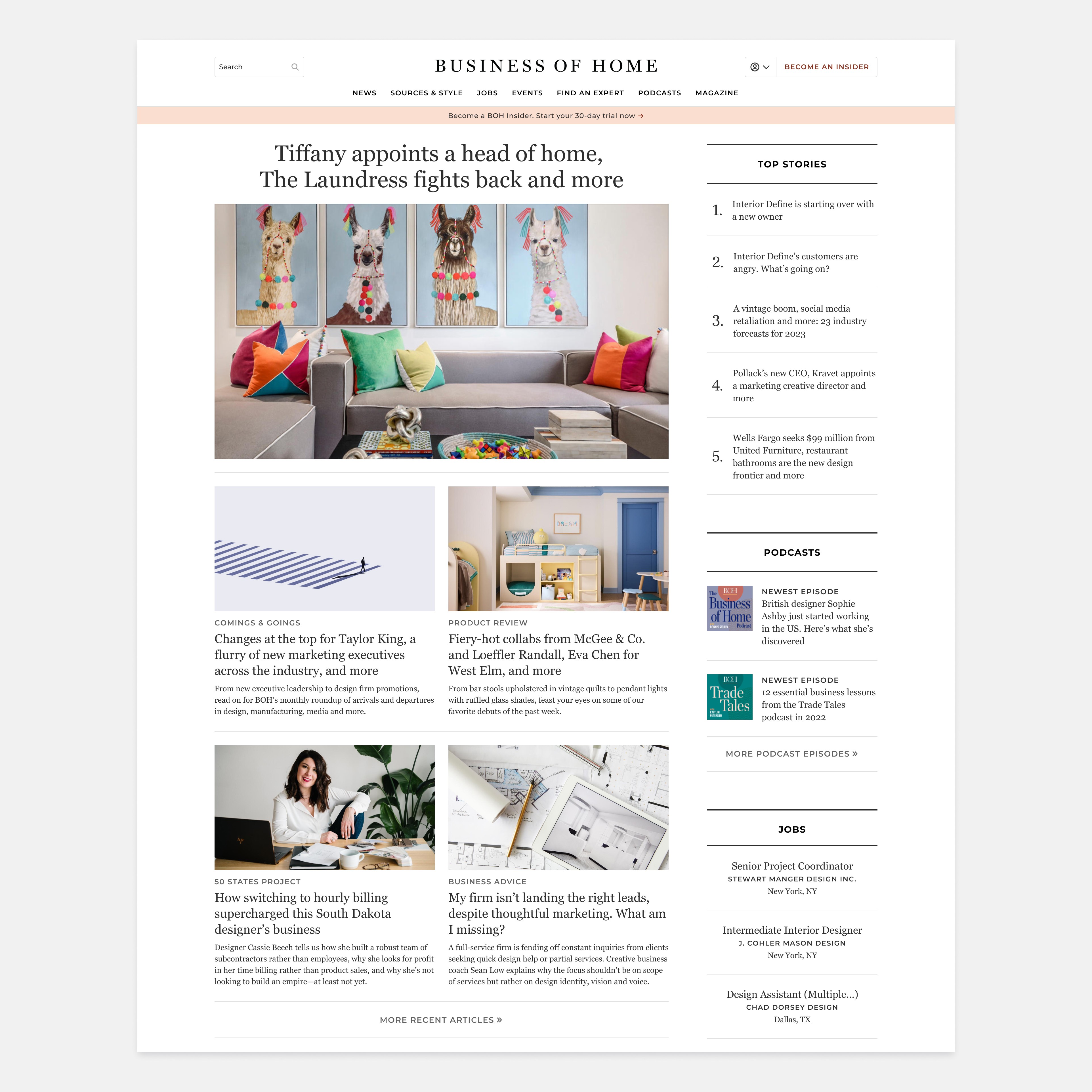
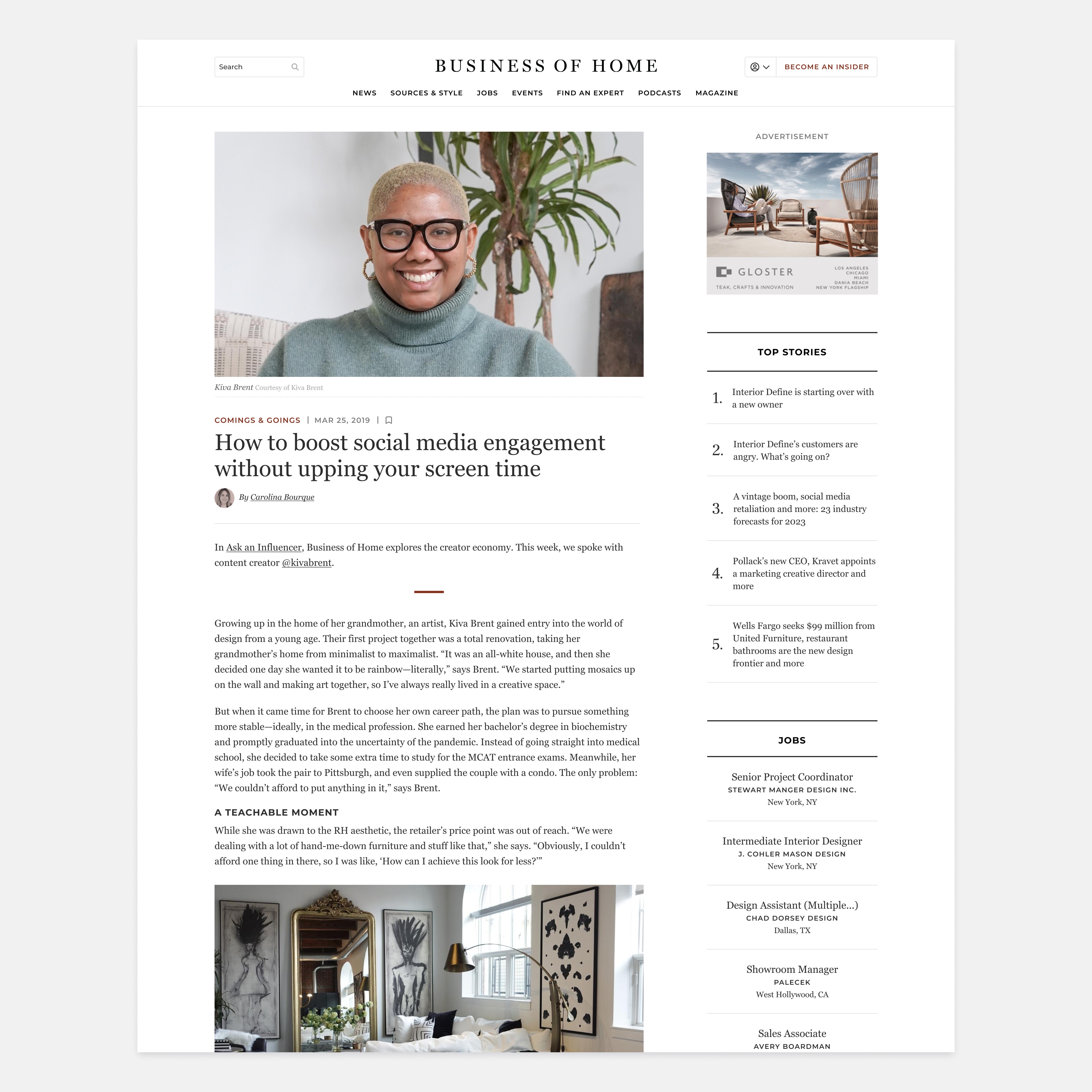
Many existing pages relied heavily on cards, borders, backgrounds, and other containers to organize information. Individually, these elements provided structure; together, they created visual clutter and competed with the editorial content.


Rather than adding another layer of styling, I simplified the experience—reducing unnecessary containers, introducing more breathing room, strengthening typographic hierarchy, and creating clearer relationships between content.


The goal wasn't minimalism for its own sake. It was to make the experience easier to scan and let the stories take priority.

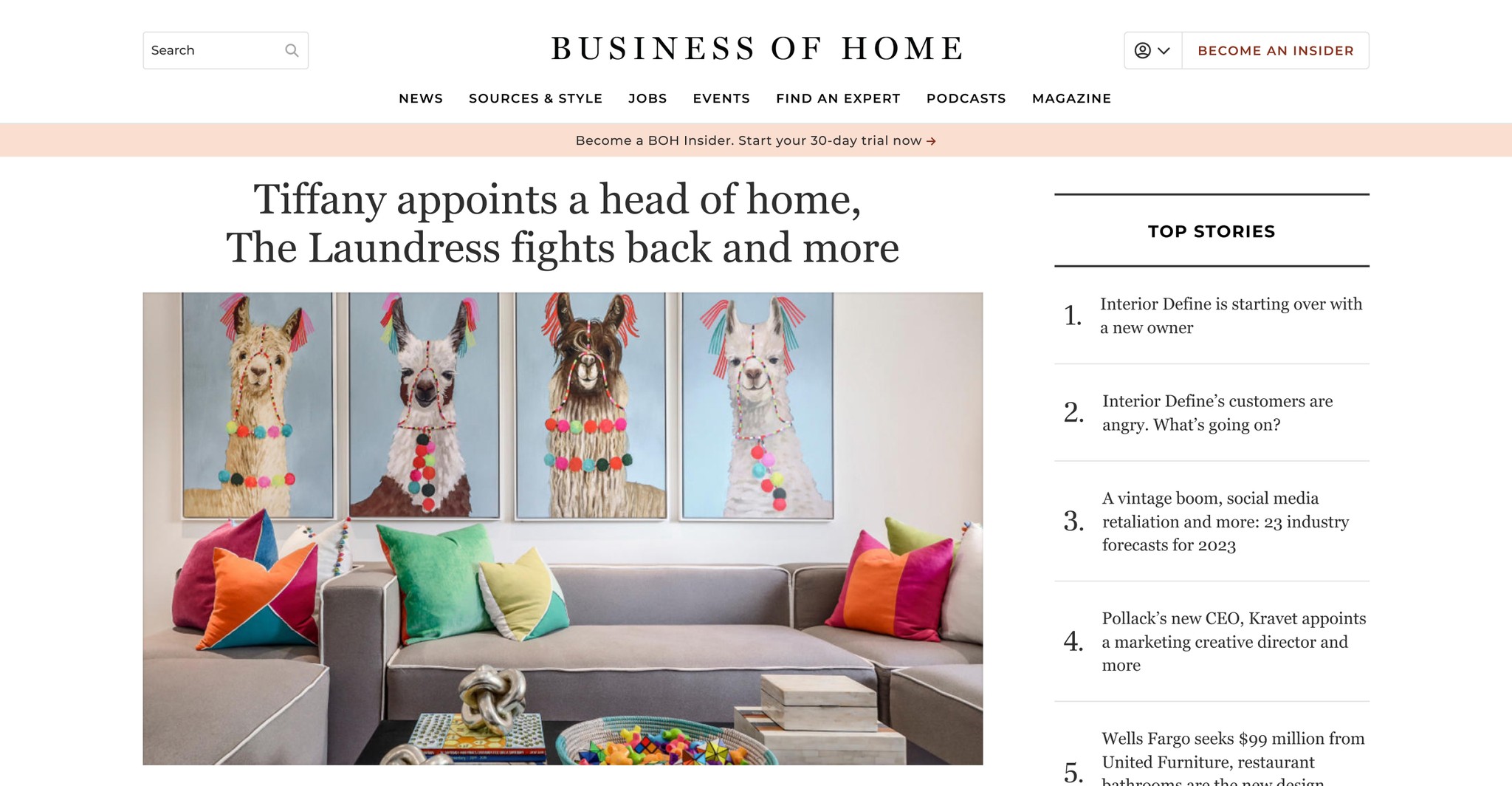
Homepage before
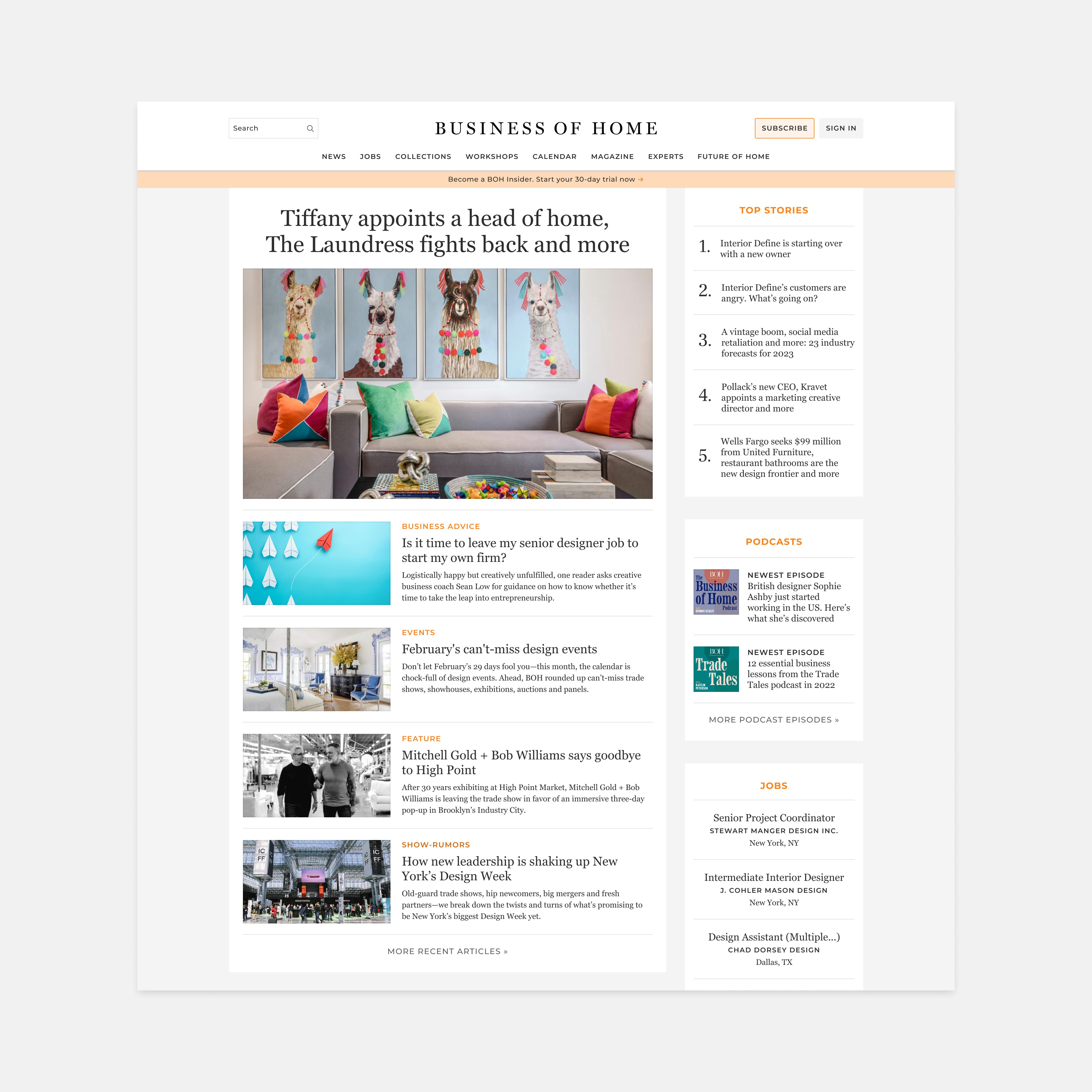
Homepage after
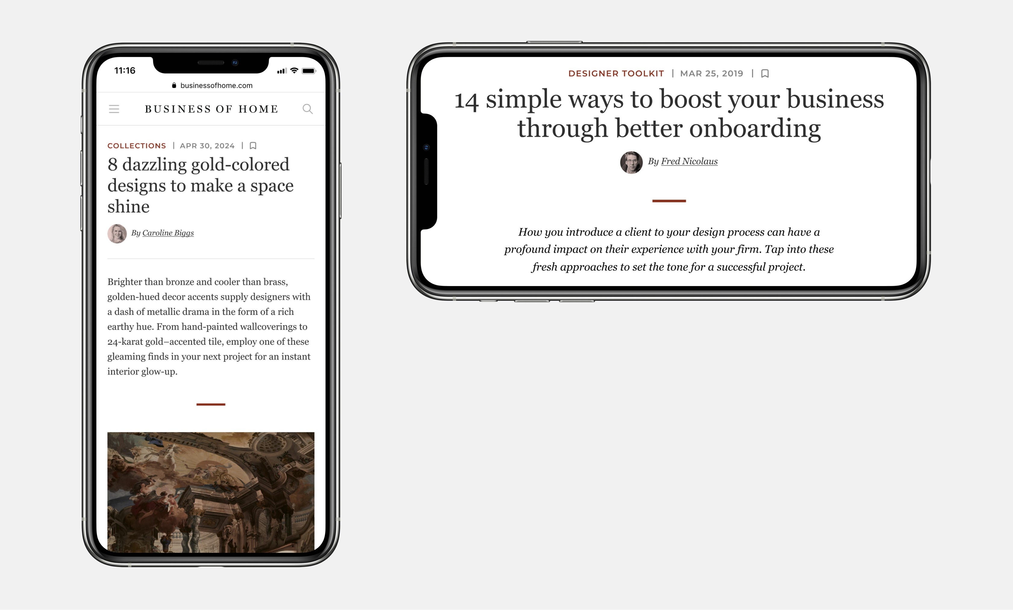
Article before
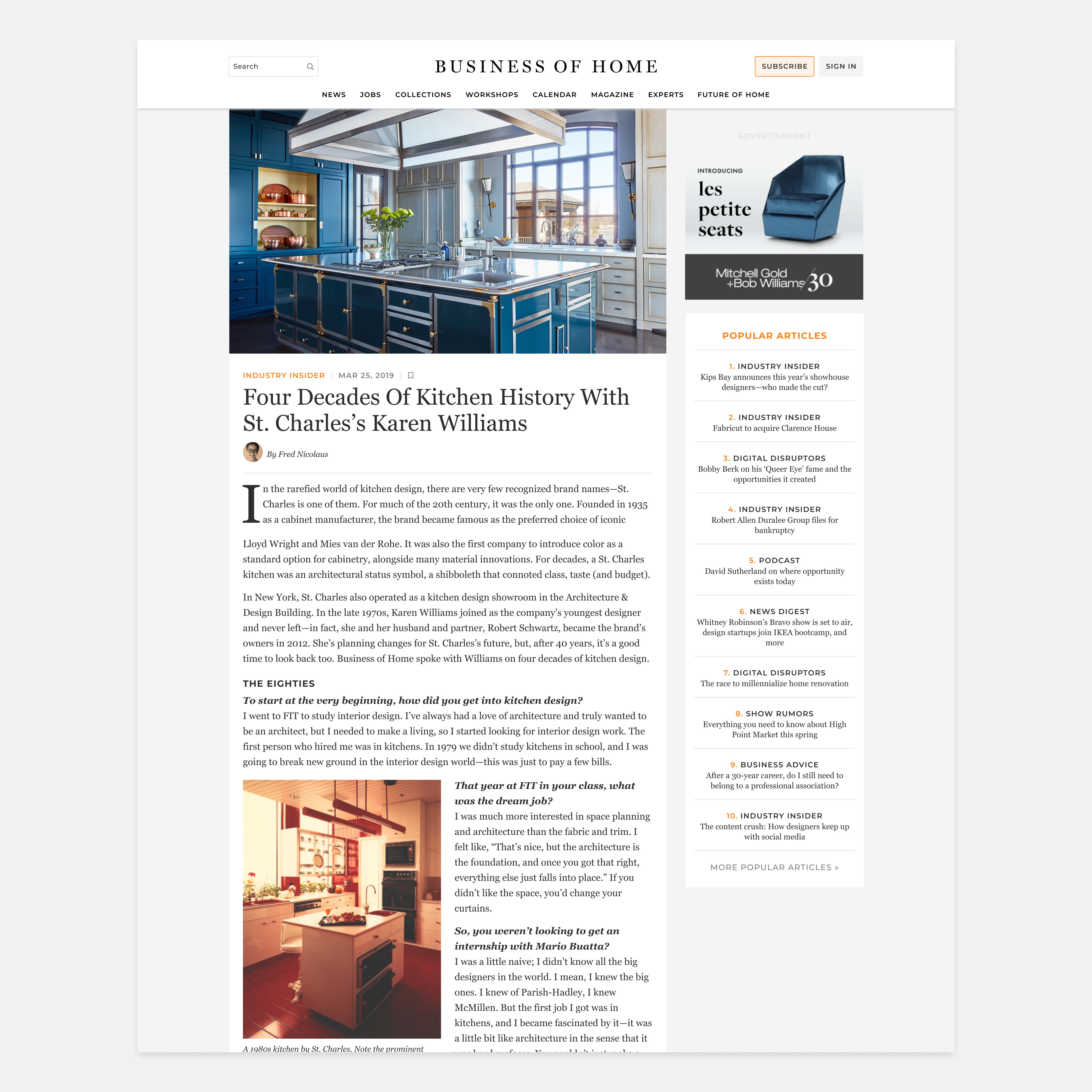
Article after
Creating Hierarchy When Imagery Isn’t Available

Simplification wasn’t always the answer.


BOH’s recordings presented a different challenge. Unlike articles, many episodes didn’t have unique imagery, making long lists of content difficult to distinguish at a glance.


I introduced a flexible color system to give each recording a recognizable visual identity. Color became functional—helping readers distinguish content while bringing more energy to an otherwise repetitive layout.

Recordings section before

Recordings section after

Key Insights

Together, these decisions established the visual direction for the broader redesign: reduce visual noise where content already provides hierarchy, and add purposeful signals where it doesn’t.

Together, these decisions established the visual direction for the broader redesign: reduce visual noise where content already provides hierarchy, and add purposeful signals where it doesn’t.

Part Two — Building a System That Could Scale

Redesigning individual pages was only part of the challenge. With 96+ pages across the platform, improving each experience independently would have created more inconsistency—and more work for a team of one designer and one engineer.


BOH had an existing style guide, but it wasn’t designed to support a product of this scale. As the redesign evolved, I saw an opportunity to turn those basic foundations into a reusable design system that could support both the immediate redesign and future product development.

Existing style guide

Finding the Right Level of Standardization

The challenge wasn’t simply making everything consistent. As an editorial platform, BOH needed enough flexibility to give different types of content their own character, while still feeling like part of the same product.


At the same time, every unique pattern added complexity. I reviewed patterns across the platform to identify where experiences could share the same underlying structure and where meaningful differences needed to remain. This helped us consolidate repeated patterns without forcing every experience into the same template.


The goal was to find the right balance:

Standardize what repeats. Keep flexibility where it adds meaning.

A single-column text component could be reused across different pages and sections with minimal adjustments

CTA text blocks were standardized with a light brand color, while custom icons were redrawn to make each block more distinctive and appropriate to its context

Building From Foundations to Components

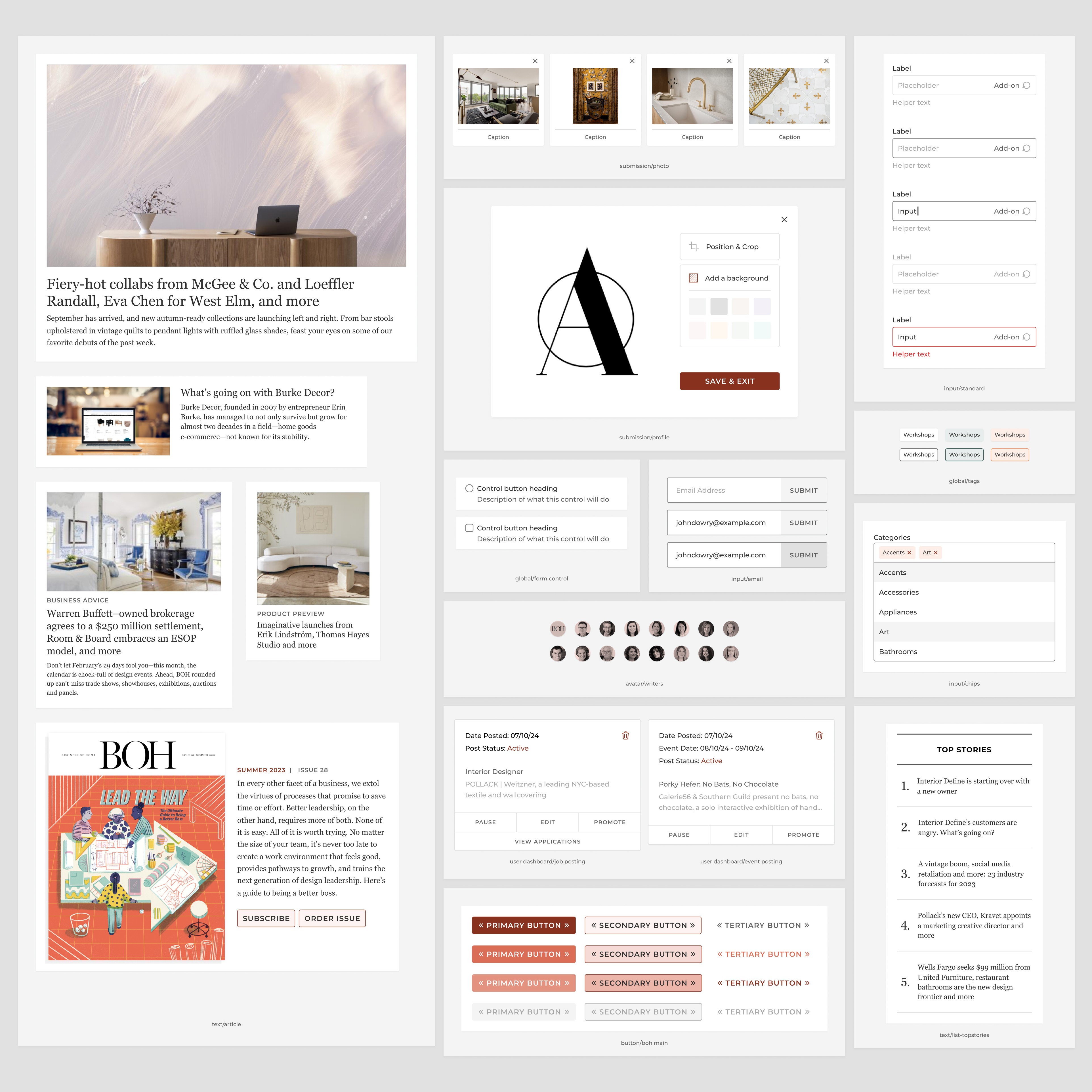
I established shared foundations for typography, color, spacing, buttons, form elements, and other core UI patterns, then used them to build a reusable component library.


Components were designed with variants and flexible content structures so the same building blocks could adapt across different editorial contexts—from articles and recordings to newsletters, events, and user-facing tools.


Instead of solving the same design problem page by page, we could increasingly solve it once and reuse it across the platform.

I established shared foundations for typography, color, spacing, buttons, form elements, and other core UI patterns, then used them to build a reusable component library.


Components were designed with variants and flexible content structures so the same building blocks could adapt across different editorial contexts—from articles and recordings to newsletters, events, and user-facing tools.


Instead of solving the same design problem page by page, we could increasingly solve it once and reuse it across the platform.

A small collection of components from the new design system
From Individual Pages to a Shared System

Over the course of the redesign, the system grew to more than 100 reusable components supporting 96+ redesigned pages.


More importantly, it gave the platform a shared visual and structural language. New experiences could build on established patterns rather than starting from scratch—making it easier to maintain consistency while leaving room for the editorial flexibility BOH needed.

Over the course of the redesign, the system grew to more than 100 reusable components supporting 96+ redesigned pages.


More importantly, it gave the platform a shared visual and structural language. New experiences could build on established patterns rather than starting from scratch—making it easier to maintain consistency while leaving room for the editorial flexibility BOH needed.

Examples from design system components

Key Wins

The value of the design system became especially clear when BOH joined a new media group and needed to adopt a new brand color palette.

What could have taken weeks to update manually across 96+ pages took only a few hours, thanks to the shared styles and reusable components built into the system.

The value of the design system became especially clear when BOH joined a new media group and needed to adopt a new brand color palette.

What could have taken weeks to update manually across 96+ pages took only a few hours, thanks to the shared styles and reusable components built into the system.

Part Three — Improving UX Within the Constraints

A full UX redesign wasn’t part of the project scope, but working across 96+ pages exposed usability issues that had accumulated over time.

Rather than ignoring them, I documented and prioritized opportunities that could meaningfully improve the experience without requiring major changes to the underlying architecture.

Over the course of the redesign, I identified and improved 20+ UX issues across reader-facing experiences, business-critical flows, and editorial tools.

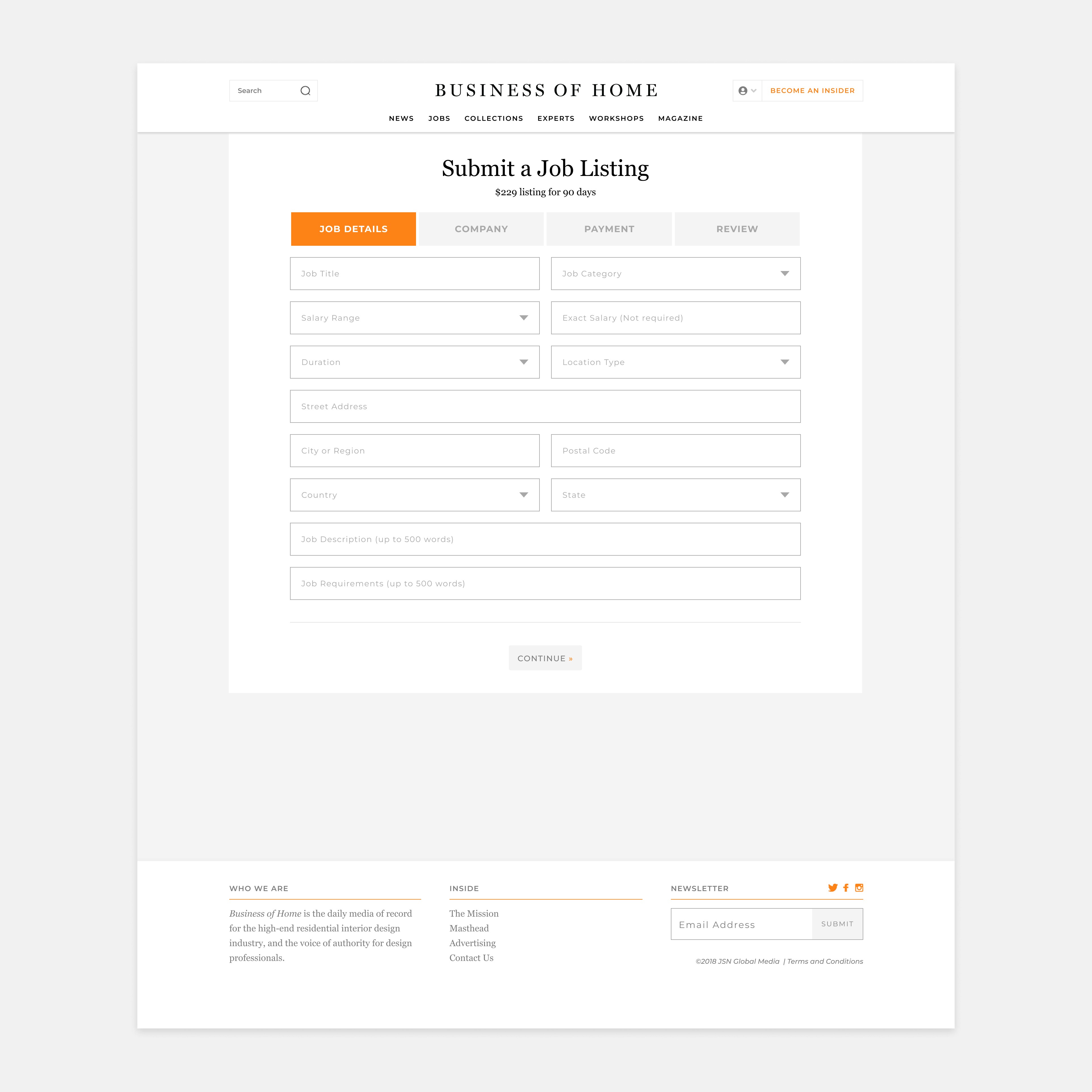
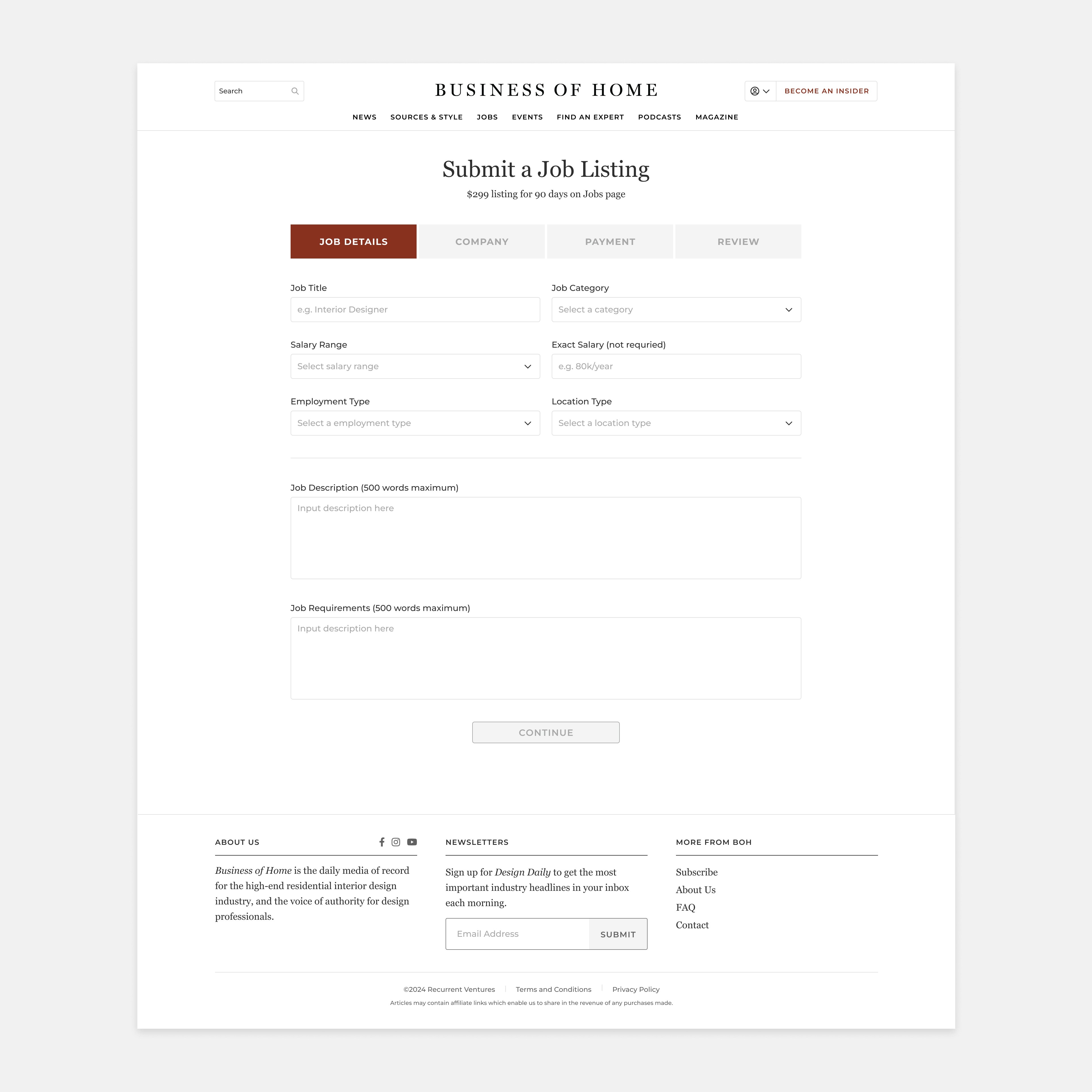
Making Forms Easier to Complete

The existing forms had obvious usability issues that made it harder for users to understand what information was expected and how to provide it.


I introduced a few simple but important improvements:

  1. moving labels above input fields so they remained visible while users typed

  1. adding example placeholder text to clarify the expected format

  2. resizing text fields based on the amount of information users were expected to provide


These changes made the forms easier to understand at a glance and gave users clearer guidance as they completed them.

The existing forms had obvious usability issues that made it harder for users to understand what information was expected and how to provide it.


I introduced a few simple but important improvements:

  1. moving labels above input fields so they remained visible while users typed

  1. adding example placeholder text to clarify the expected format

  2. resizing text fields based on the amount of information users were expected to provide


These changes made the forms easier to understand at a glance and gave users clearer guidance as they completed them.

Input form before

input form after

Improving Business-Critical Experiences

I also identified opportunities within experiences directly connected to BOH’s business.


Rather than redesigning these flows from scratch, I focused on targeted changes that could make existing experiences clearer and easier to navigate while working within the established structure.

I also identified opportunities within experiences directly connected to BOH’s business.


Rather than redesigning these flows from scratch, I focused on targeted changes that could make existing experiences clearer and easier to navigate while working within the established structure.

User Dashboard/BOH Newsletters before

User Dashboard/BOH Newsletters After

Making Internal Tools Easier to Use

The redesign also surfaced usability issues within tools used by BOH’s editorial team. Small improvements to hierarchy, interactions, and UX copy helped make everyday tasks more understandable without requiring major changes to the underlying system.

The redesign also surfaced usability issues within tools used by BOH’s editorial team. Small improvements to hierarchy, interactions, and UX copy helped make everyday tasks more understandable without requiring major changes to the underlying system.

Reflection

Small Changes, Meaningful Improvements
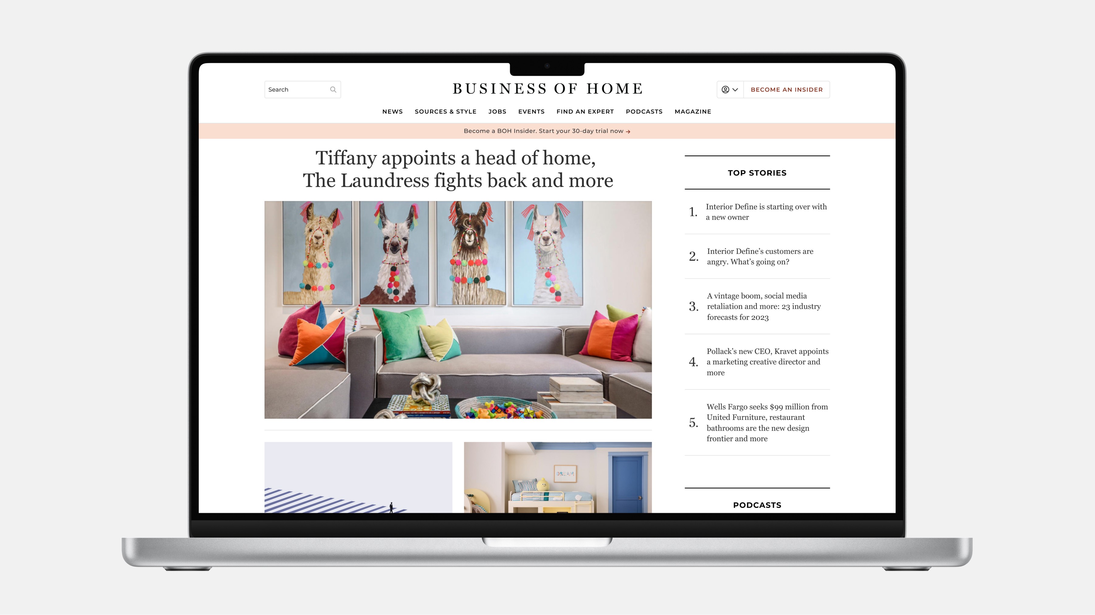
This project reinforced that meaningful product improvements don’t always require rebuilding from the ground up.


Working within BOH’s constraints meant being deliberate about where change could have the greatest impact: simplifying the experience where the interface competed with content, building a flexible design system that could scale across 96+ pages, and addressing usability issues through focused UX improvements.


The design system proved especially valuable when BOH later needed to adopt a new brand palette—turning what could have been weeks of updates into just a few hours.


Ultimately, the project taught me that designing within constraints isn’t just about compromise. It’s about creating leverage—making thoughtful changes today that make the product easier to use, maintain, and evolve tomorrow.

This project reinforced that meaningful product improvements don’t always require rebuilding from the ground up.


Working within BOH’s constraints meant being deliberate about where change could have the greatest impact: simplifying the experience where the interface competed with content, building a flexible design system that could scale across 96+ pages, and addressing usability issues through focused UX improvements.


The design system proved especially valuable when BOH later needed to adopt a new brand palette—turning what could have been weeks of updates into just a few hours.


Ultimately, the project taught me that designing within constraints isn’t just about compromise. It’s about creating leverage—making thoughtful changes today that make the product easier to use, maintain, and evolve tomorrow.

Get in touch

Send an email or DM on LinkedIn and I'll get back to you asap.

All rights reserved © 2026 Eva Yu Design

Get in touch

Send an email or DM on LinkedIn and I'll get back to you asap.

All rights reserved © 2026 Eva Yu Design

Lights on·off